5 Reasons Your Landing Page Isn’t Converting
A landing page is not a web page. Say it with me…a landing page is not a web page. The sole purpose of a landing page is to convert visitors into a lead, or a lead into a customer, or a customer into an evangelist for your company. A landing page must convert. If your visitors aren’t converting on your landing page, you could be making any of the common mistakes listed below. The good news is that they’re easy to fix. Here are the 5 reasons your landing page isn’t converting:
No Clear Call to Action
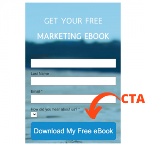
If your website is getting traffic and your paid ads are getting impressions, but you’re not seeing visitors to your landing page, you probably need a better call to action. A good call to action (CTA) must show your customer “What’s in it for me?” immediately. What are their pain points and how can you fix them? And even more importantly…what do you want them to do about it?
Furthermore, if your visitors can’t find your CTA, they’re never going to find out what’s in it for them. Be sure that CTA’s not only contained clear, urgent, exclusive value propositions but also stand out in ads or landing pages. Make them the dominant image, use contrasting colors, always make them clickable, and make sure they stay above the fold.
Giving Them An Escape Route
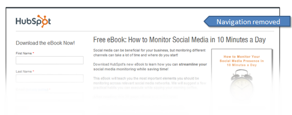
Notice that nobody calls it an “intersection page” or a “runway page.” That’s because once a customer gets there, we don’t want them going anywhere else…even back to our webpage (that is until they’ve filled out our smart form and become a conversion). Cloning the style, color scheme, and layout of your main web page is a good strategy for a landing page as long as navigation options are removed.
No Dedicated, Single Focus
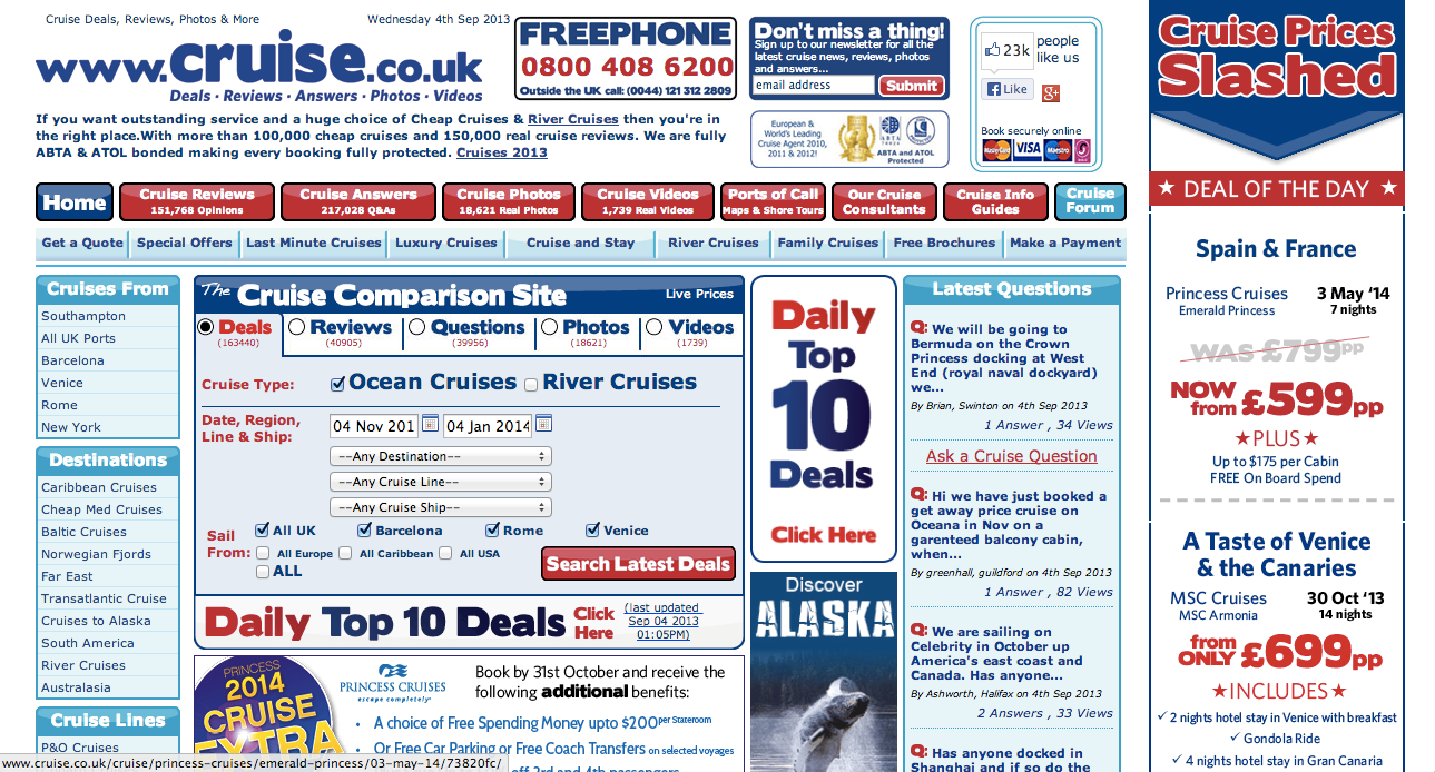
You’re directing traffic to your landing page for one, very specific reason…or at least you should be. So why would you take their eyes off of your well-thought-out CTA and shift them to a banner ad at the bottom of the page, or to a slider image of other products? Be certain that your CTA is an oasis in the desert of your landing page.
Lack of Imagery
At this point in our society, I think that we can all agree…people hate to read. Well, maybe they don’t “hate” to read, but we’re bombarded with so much information daily that we’ve run out of time to read. In the interest of creating a simple, clear, and concise landing page, some make the mistake of either not including imagery or using the wrong types of imagery. A good image makes your visitor feel something…hopefully, something that makes them click on your CTA and convert. They can feel happiness, sadness, anger, or myriad other feelings, but they should feel SOMETHING. Good imagery should also do the following:
- Clearly express the meaning and importance of your content
- Be eye-catching
- Tie seamlessly into the page
- Encourage action
No Follow-Up
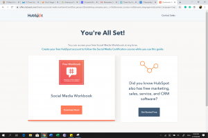
Sure, it’s a lot of work to create the perfect landing page, optimized for conversions instead of bounces. But you did it! I couldn’t be more proud of you…except you quit right before the finish line. Many companies fail to create adequate “Thank You” pages for their new customers to land on after a conversion. Don’t confuse a “Thank You Message” with a “Thank You” page. The prior is simply a pop-up that lets the visitor know they’ve successfully done something but is quickly clicked out of and leaves the new customer wondering what he should do next. The latter immediately presents the new customer with his value offering and then gives him more options. A good Thank You Page should include:
- A secondary value offering or CTA
- Social share options
- More relevant content
Read more about website optimization and the google enforcement zoo here.


![Digital-Marketing[1]](https://kngmarketing.com/wp-content/uploads/2016/03/Digital-Marketing1.png)
